Wednesday, October 19, 2011

PowerPoint Assignment


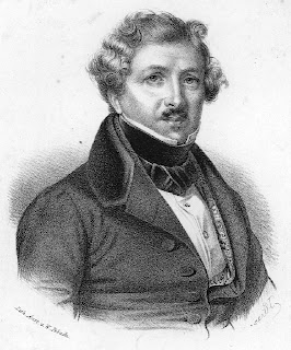
I am planning on doing my presentation on this man, Loius Jacques Mande Daguerre.  Daguerre was the one to invent the photography process that started to put an end to painting: the Daguerreotype.


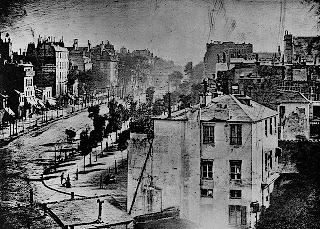
This is the first image produced by Daguerre using his Dguerreotype process.

I have no idea who this man is but I wanted this picture to 1: show you what the first Daguerreotype camera looked like, and 2: how large they were.  It's crazy to imagine that we went from this, to being able to slide our cameras into our pockets!
Tuesday, October 11, 2011

Indoor Enhancement


This project proved a little more difficult because my house it very naturally lt as it is due to the fact I live in a rural area with a lot of large windows.  So I did as best as I could without a flash and edited to make the picture have more natural colors.


This is the edited picture from the one above.  I wanted to draw more attention to my dog so I cropped out quite a bit.  Along with the cropping I did a lot of playing around with PhotoShop to bring out these colors.  I did very little with the vibrance layer, only bringing the vibrance up to +5.  As for the brightness and contrast, I brought both of those up considerably; the brightness going up to +45 and the contrast all the way up to +81.  I also added the Hue/Saturation layer to the photo.  I brought the hue up to +4, the Saturation to +32 and I lowered the "Lightness" down to -20 because the picture jus glared too much with all of the extra light. 

Outdoor Enhancement


This is the original picture that I took at Warvel Park in North Manchester.  At first when I looked at this picture I thought I was going to have a difficult time enhancing the colors.  Just from looking at it I thought that it was already good enough.  I was wrong!


This is the edited or enhanced picture.  As you can tell I was able to make the colors flourish and come more alive.  I used PhotoShop CS5.5 in order to make this picture more lively.  I used the vibrance tool in which I took the vibracy up to about +71 and the saturation up to +19.  I did this in order to make the colors more natural and bright instead of dull and boring from the first picture. 

Name Project


This is what I came up with when finding objects for my name. 

M: The "M" is from a bicycle rack that is in front of the North Manchester public library.  I had to cut out quite a bit to make it look more like the letter that I wanted
I: I was able to take a snapshot of the front door of the Liverty Mills Post Office. 
C: This one was a little difficult for me to find but I was able to get a decent angle on the handle of a coffee mug.
H: This one caught my eye as I was taking a walk.  I was able to make this letter from the seesaw at the park in Liberty Mills.
A: This is the side of a bell outside of my church. 
E: The wood on the backside of this fence made it possible to get an "E."  I had to get at an angle on order to make it more realistic.
L: This is the meter that is on the side of my fiance's parents' house.

Wednesday, September 28, 2011

Banner/Logo Numero Dos


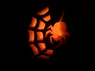
Here I made another border to celebrate the upcoming holidays.  The actual border is one that I found through the clip art searches in PowerPoint.  The picture in the middle (the spider) is a pumpkin that I carved.  I took the picture with very very little light and just used the tealights within the pumkin to give this effect.  As you can see I also indserted the text "Happy Halloween."


This was the original picture that I used to make the inside of the banner.  It's pumpkin carving that I made and used only the candle light as my source of light to really bring out the design.

Wednesday, September 14, 2011

Banner/Logo


This banner is one that inspires me the most.  I wanted to find a border that went somewhat along with the theme of my blog so I thought this one fit nicely.  At first it was an orange color but changed it to black and white.  This particlular quote I have loved since I first read it.  It says "I choose to live, not just exist."  This was said by James Hetfield the main guitarist from Metallica and my favorite musician...period.  This inspired me so much that I have the quote tattooed across my upper back from shoulder to shoulder. 

Tuesday, September 13, 2011

Photoshop Cropped


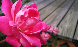
This first picture is the original one posted for the Depth of Field assignment.  It took a while to decide which one to use but I kept looking at this one, deciding that there was too much around the edges that was taking the attention away from the main object. 


This is the cropped version of the picture above.  Although there isn't too much difference in them, I can tell that there is a lot more focus on the rose rather than the surrounding areas.  I kept the far left edge of the picture the same because I didn't want to lose any more of the rose than what I had to.  As for the other edges, I brought in the top and bottom, cutting off a little bit of the rose pedals to bring the view in more.  Also, I brought in the right side enough to take away the legs of the swing and some of the porch, but not too much in order to keep the depth of field effect.